
What is Shadcn?
Shadcn UI is not defined as a specific component library or UI framework. As mentioned in the documentation, it is characterized as a collection of reusable components that can be easily copied and pasted into your applications.
Shadcn uses Tailwind CSS and Radix UI as its foundation. It currently supports Next.js, Gatsby, Remix, Astro, Laravel, and Vite. There is a
manual integration guide that can assist you in incorporating it with other technologies.
You can access the complete source code for this tutorial here.
How to Install Next.js generally use npm :
npx create-next-app@latest
How to Install Shadcn
npx shadcn@latest init
After running one of those commands you'll see some configuration questions again, but this time they're for Shadcn:
✔ Which style would you like to use? › New York
✔ Which color would you like to use as base color? › Slate
✔ Would you like to use CSS variables for colors? › yes
The code above shows the questions and my answers. New York and default are the two choices for the first question. The "New York" style is what I went with. There are five answers to the second question. Stone, Neutral, Zinc, Gray, and Slate. Because I enjoy simple black and white design, I went with Slate. There are two answers to the third question: Yes and No. Although we won't be using CSS variables for styling in this article, I went with yes because I prefer to have them enabled. More information about this configuration setup, style options, and base options can be found here. You've now created a new Next.js 14 project with Shadcn. Two new directories are now visible that
How Shadcn Is Used in Next.js
Let's start by clearing out the page.tsx file for the my-app project of all boilerplate code. (The boilerplate code in my-app/page.tsx is the only thing you need to delete
I'll add a basic hello world text after eliminating all of the boilerplate code from the page.tsx file located inside the app directory.
This page has been updated.
export default function Home() {
return (
        <div> Hello World </div>
   )}
Methods of Form Style: The Shadcn Approach vs. the Challenging Method
Currently, let's add two forms to the page.
One form will use a Shadcn component, while the other will be simple with no styling.
How to Incorporate a Shadcn Component
However, we need to understand the process of incorporating a Shadcn component into our project before we move forward to add our buttons. The steps are as follows:
npx shadcn@latest add form
Define a form Use the useForm hook from react-hook-form to create a form.
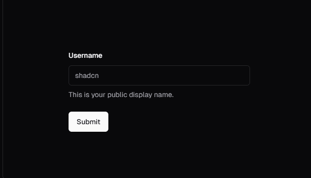
"use client";
import { useForm } from "react-hook-form";
import { Button } from "@/components/ui/button";
import {
  Form,
  FormControl,
  FormDescription,
  FormField,
  FormItem,
  FormLabel,
  FormMessage,
} from "@/components/ui/form";
import { Input } from "@/components/ui/input";

export function ProfileForm() {
  return (
    <Form {...form}>
      <form onSubmit={form.handleSubmit(onSubmit)} className="space-y-8">
        <FormField
          control={form.control}
          name="username"
          render={({ field }) => (
            <FormItem>
              <FormLabel>Username</FormLabel>
              <FormControl>
                <Input placeholder="shadcn" {...field} />
              </FormControl>
              <FormDescription>
                This is your public display name.
              </FormDescription>
              <FormMessage />
            </FormItem>
          )}
        />
        <Button type="submit">Submit</Button>
      </form>
    </Form>
  );
}
result is like that
Shadcn is a versatile tool that simplifies the process of building reusable, styled components for modern web applications. By leveraging Tailwind CSS, Radix UI, and Zod for validation, it provides a robust foundation for creating accessible, type-safe, and visually appealing UI elements.
Integrating Shadcn into frameworks like Next.js is straightforward, enabling developers to quickly configure styles, colors, and variables to align with their project's design system. The use of tools like react-hook-form and Zod ensures seamless form handling and validation, streamlining development.

blog for programmers
Explore the latest insights, articles,free components, and expert advice on programming and software development


